Mapping a web-based data visualization of my 40-days Art Journal routine, capturing personal insights and experiences.
This project maps a web-based data visualization of my 40-day art journaling journey, capturing moods, emotions, and creative patterns. It offers a visual narrative of personal growth, self-reflection, and thematic exploration through daily artistic expression. The goal is to reveal meaningful insights hidden within the creative process.
TITLE
Web-based Data Visualization
ROLE
Designer
HATS WORN
UI/UX Design, Web Design, Visual Design & Tabulation
DURATION
2023
TOOLS
Adobe Creative Suite, Microsoft Excel & Keynote
TEAM
Individual Project
PROBLEM STATEMENT
How might we design a web-based system that transforms daily activities into a structured, easily trackable format through intuitive tabulation?
SOLUTION
Tracking artistic patterns and emotional influences over time can be challenging. This project visualizes 40 days of an art journal through a web-based data visualization, mapping moods, feelings, and creative concepts to reveal insights into the artistic process and thematic evolution.
PROCESS
How it all began!
Over a span of 40 days, I systematically recorded key details such as date, day, time, weather conditions, activities, people around me, duration, emotions, location, music and sleep patterns. The complete dataset is available in the below linked spreadsheet for review.
Key insights from the Dataset
I practiced daily art journaling based on various themes or prompts, using different journal sizes, based on time availability.
Organizing & Color-coding the Dataset
I organized and color-coded my art journal data from the primary dataset, categorizing it by day, date, emotions before and after journaling, themes, gratitude prompts (and their reflection in my journal), journal size. color palette, duration, time of day, social media presence, and documentation mode (photo, video, or both).
FINAL DESIGN
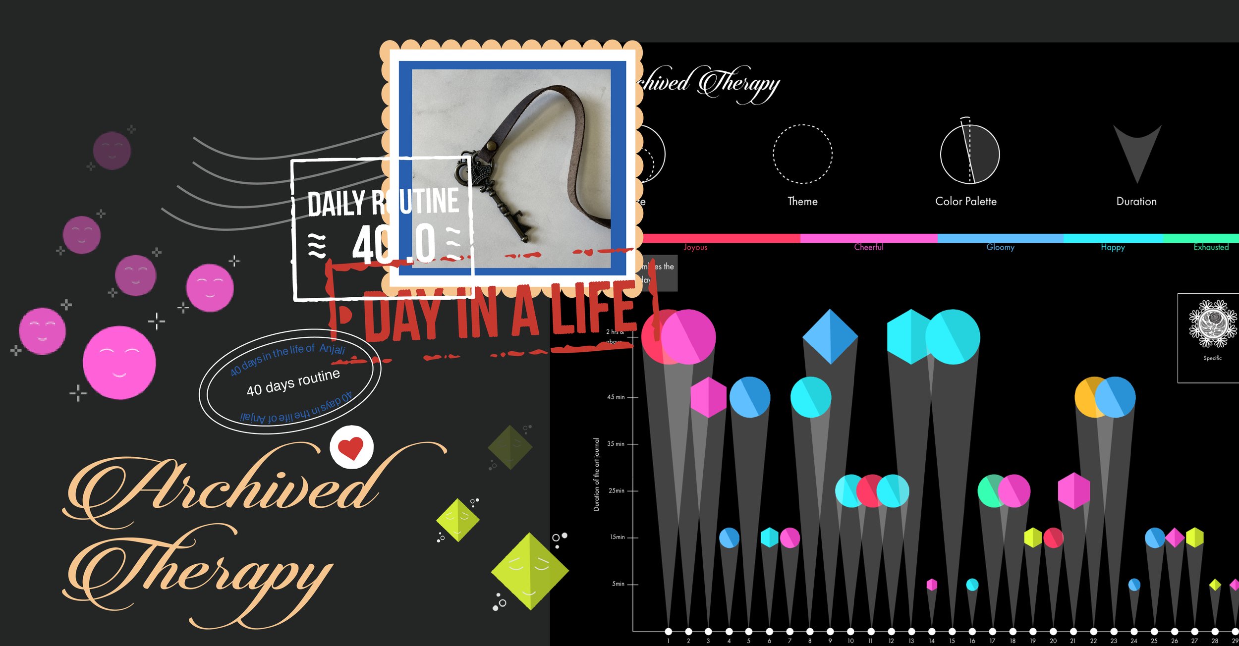
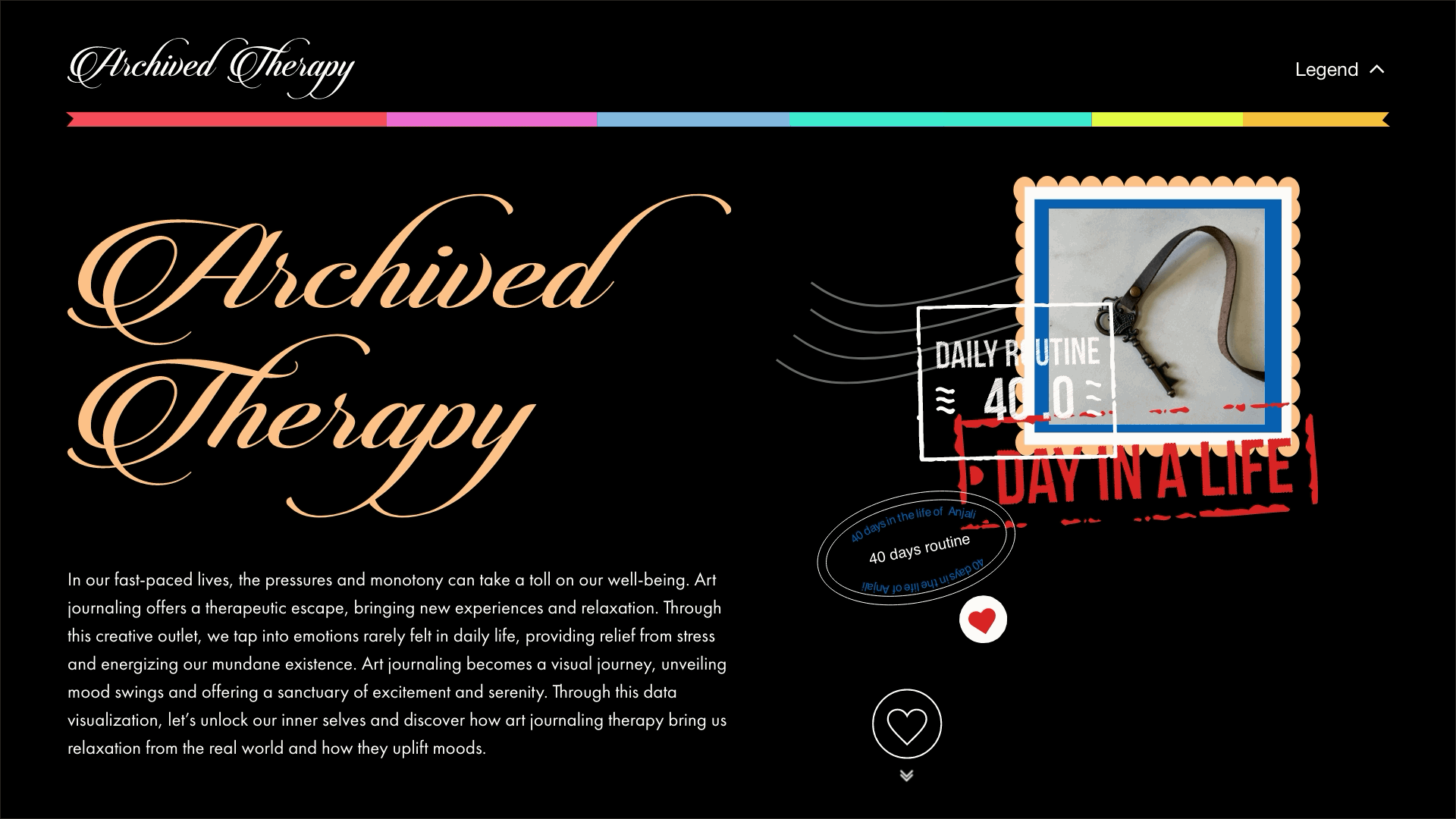
The web-based data visualization, titled “Archived Therapy”, serves as a means of translating my subconscious mind into a tangible, conscious experience.
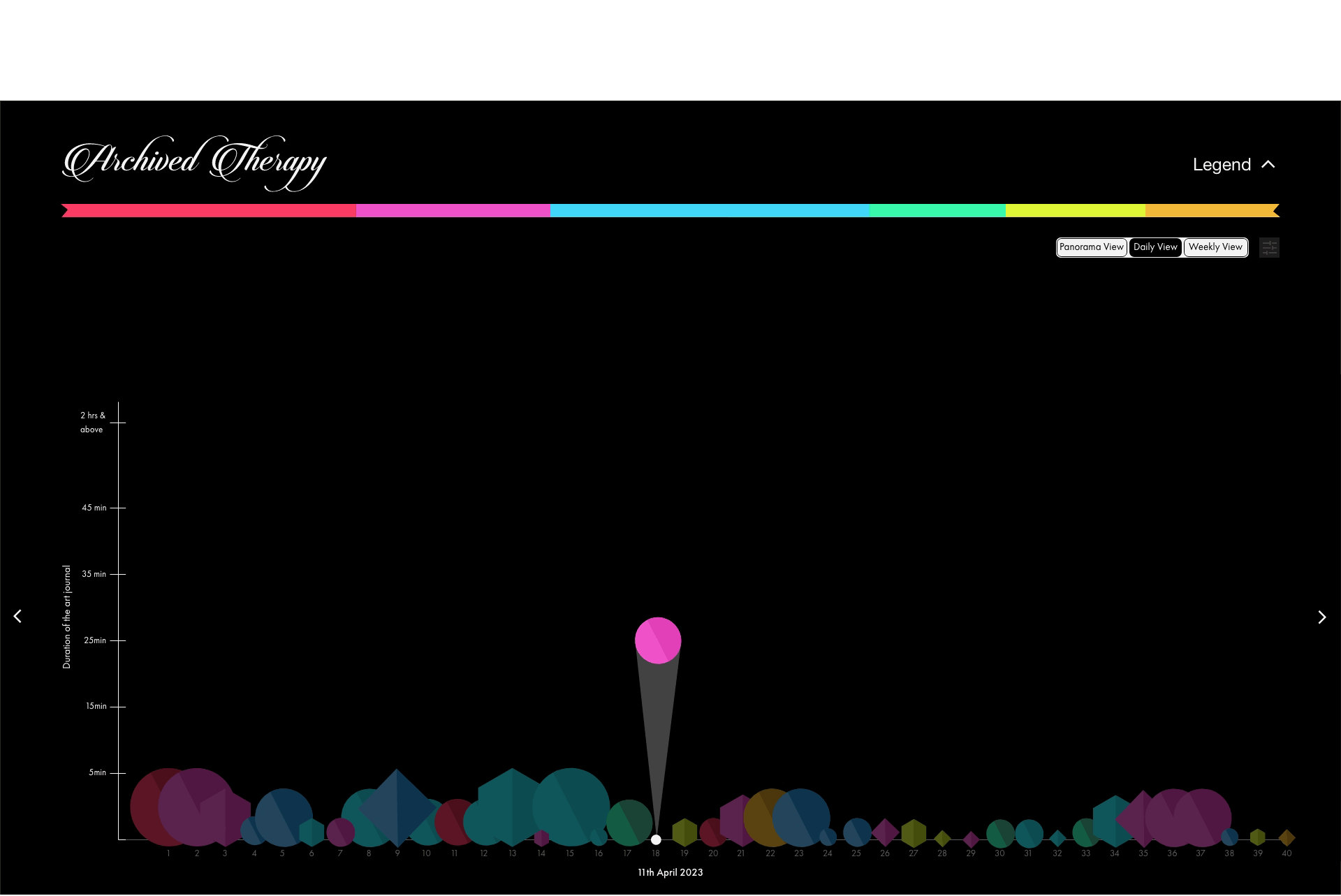
The representation below illustrates my journal size, the theme explored, the color palette used, the duration, my emotions throughout the day, and the emotional shift experienced after creating the journals.

Adding more to the above representation, activity can be tracked on a daily or weekly basis, in addition to the Panorama view.

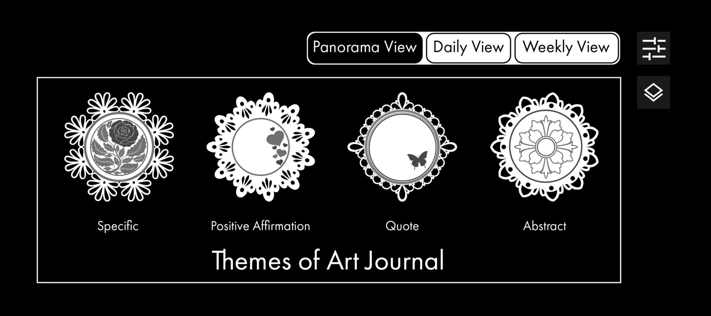
Different dollie sheets have been used to represent the various themes of the Art Journals.
MODEL PREVIEW
1. Users can access the legend to view details or navigate to the main Panorama view by tapping on the legend menu at the right hand side top of the screen.

2. Tap the heart icon—once it turns red, it indicates that you're ready to proceed to the main page.
3. In addition to the legend, there is a toggle button that provides a deeper exploration of the journal’s themes.

4. Let’s take a quick look at the Daily View for a better understanding of how this web-based data visualization works.
4. Here’s a final look at the Weekly View. Don’t forget to explore the prototype for a hands-on-experience!


TAKEAWAY
This data visualization offers a unique glimpse into my 40-day Art Journal routine, mapping the interplay between moods, themes, creative expressions, and daily influences. By analyzing patterns in emotions, color palettes, journal sizes, and creative prompts, the project highlights the therapeutic impact of journaling and its role in self-reflection and artistic exploration.
To enhance the experience, I used Adobe XD to prototype the interface, incorporating hover effects, interactive elements, and playful animations to bring the visualization to life. These dynamic interactions add a sense of engagement and fluidity, making the exploration of data both intuitive and immersive. This visualization serves as both personal archive and an interactive experience.