Creating an Intuitive dashboard for Athletes Mobile App to enhance user engagement and monetization.
An App that empowers athletes globally, offering innovative platforms for talent showcasing, networking, & opportunity attraction, revolutionizing the sports engagement landscape.
TITLE
Next Level (nXlvl) App & Web Design
ROLE
Senior Product Designer
HATS WORN
UI/UX Design, Visual Design, End-to-end.
KEYWORDS
Startup, B2B, B2C, SAAS App
DURATION
2022- Present
TOOLS
Figma, FigJam, Zepline, Adobe Creative Suite & Keynote
TEAM
Software Engineers-Cygnet Infotech, Tester, Marketing Team, & Operations Technology.
Please connect to get the complete Figma tour!

MY CONTRIBUTIONS
Building a Comprehensive Design System from the Ground Up.
Crafting and Defining Cohesive Brand Guidelines.
Redesigning and Enhancing the Mobile Application While Integrating New Features.
Leading Design Reviews to Maintain Consistency and Deliver High-Quality User Experiences.
Collaborating Cross-Functionally with Researchers, Engineers, and Project Managers to Align Priorities and Implement Feedback Seamlessly.
Currently working on implementing “Go Live & View Live Feature” in the app.
PROBLEM STATEMENT
How might we create an app that empowers athletes globally, therby revolutionizing the sports engagement landscape?
SOLUTION
Empowering athletes worldwide with a dynamic platform to showcase talent, build networks, and seize opportunities, transforming the future of sports engagement.
To revolutionize the sports engagement landscape and empower athletes globally, we will create an app that will feature comprehensive athlete profiles, including portfolios and embedded media, robust networking and community-building tools, talent showcasing and discovery capabilities, career development resources, and real-time engagement features. It will also support multiple languages and include accessibility and cultural inclusivity features, ensuring a diverse and global reach. This app will help athletes showcase their talents, build networks, and access opportunities, transforming how athletes engage with the sports world.
IMPACT
The nXIvl connect feature (Intuitive Dashboard) increased user engagement by 65%, boosted app downloads by 25%, and led to 45% increase in sports properties.
The nXlvl Build Your Activity Profile, boosted a revenue of $3M.
The improvement of the digital assets, boosting user satisfaction through refined user interfaces and technological advancements, increased user engagement by 35%.
PROCESS:
Started with benchmarking. Concluded with A/B testing to maximize business imapact.
When I joined as a volunteer, I quickly realized that things were not in good shape—everything felt unstructured and disorganized. Seeing this, I took the initiative to highlight the importance of a well-defined Design System and Brand Guidelines, explaining how they could drive long-term consistency and efficiency. This marked a turning point, and I took the first step toward making it happen. The journey began with thorough research, benchmarking industry best practices, and laying the foundation for a more structured and cohesive design approach

Furthermore, designing the spectrum of features, encompassing onboarding screens, the home screen, user profiles, search navigation, discovery mechanisms, and messaging interfaces, culminating in successful deployment., required understanding of the existing design and ensuring consistency. I began by exploring the current NEXT LEVEL App service. Additionally, I incorporated experimental designs to create a distinctive design. To assess its effectiveness, I conducted A/B testing after the launch, leading to design optimization based on the results.
DESIGN STEPS
1. Establishing Brand Guidelines
Brand Guidelines are a set of rules that define how a brand's identity should be represented consistently across all media. They include details on logo usage, typography, colors, imagery, tone of voice, messaging, and legal usage.

2. Creating a Design System
A Design System is a collection of reusable components, patterns, and guidelines that ensure consistency in design and user experience across a product. It includes visual elements (colors, typography, icons), UI components (buttons, forms, navigation), and rules for their usage, along with development standards.

3. Conducting User & Market Research
Competitive Analysis: Study similar apps and industry trends.
User Surveys & Interviews: Gather insights from potential users.
Define User Personas: Identify user needs, pain points, and goals.
Analyze Existing Pain Points: Understand issues in the current system.

4. Creating Wireframes & User Flows
Sketch low-fidelity wireframes to define basic layouts.
Develop user journey maps to ensure smooth navigation.
Validate structure with stakeholder and user feedback.

5. Designing High-Fidelity UI & Prototyping
Create detailed high-fidelity screens in Figma.
Design micro-interactions and animations for better UX.
Develop an interactive prototype for usability testing.
6. A/B Testing & User Validation
Test different UI versions (A/B testing) to find the best-performing design.
Conduct usability tests with real users and gather feedback.
Iterate on designs based on test results.
7. Developer Handoff & Implementation
Organize Figma components for seamless developer handoff.
Provide detailed design specifications and assets.
Collaborate with developers to ensure pixel-perfect implementation

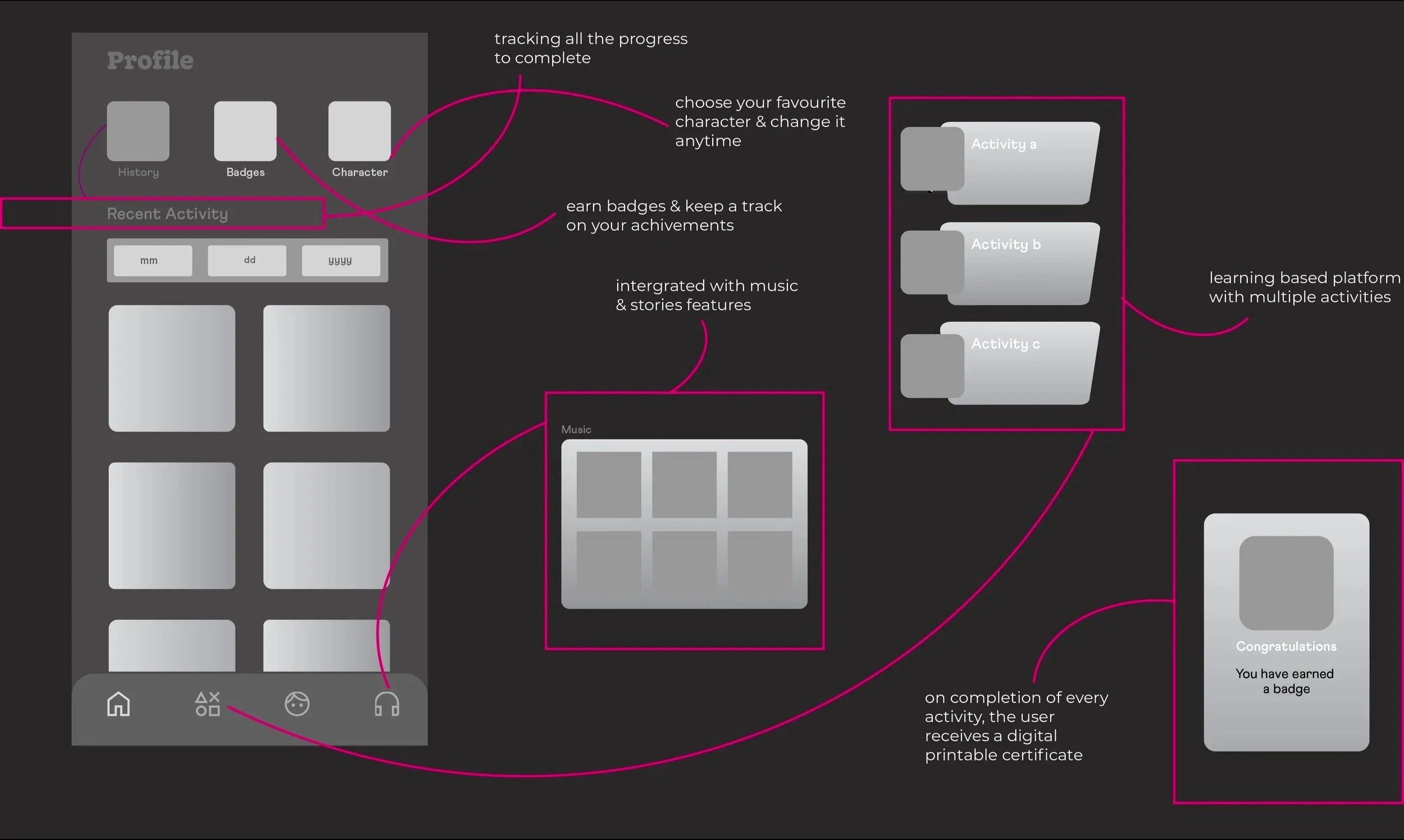
FEATURE DESIGN
What is nXlvl connect?
nXlvl Connect is a feature within the nXlvl ecosystem designed to help student-athletes build and manage their personal brands, connect with fans, and engage with brands for NIL (Name, Image, and Likeness) opportunities. nXlvl Connect offers athletes the ability to create personalized profiles that showcase their achievements, social media presence, and highlight reels, which can be easily discovered by recruiters and brands.
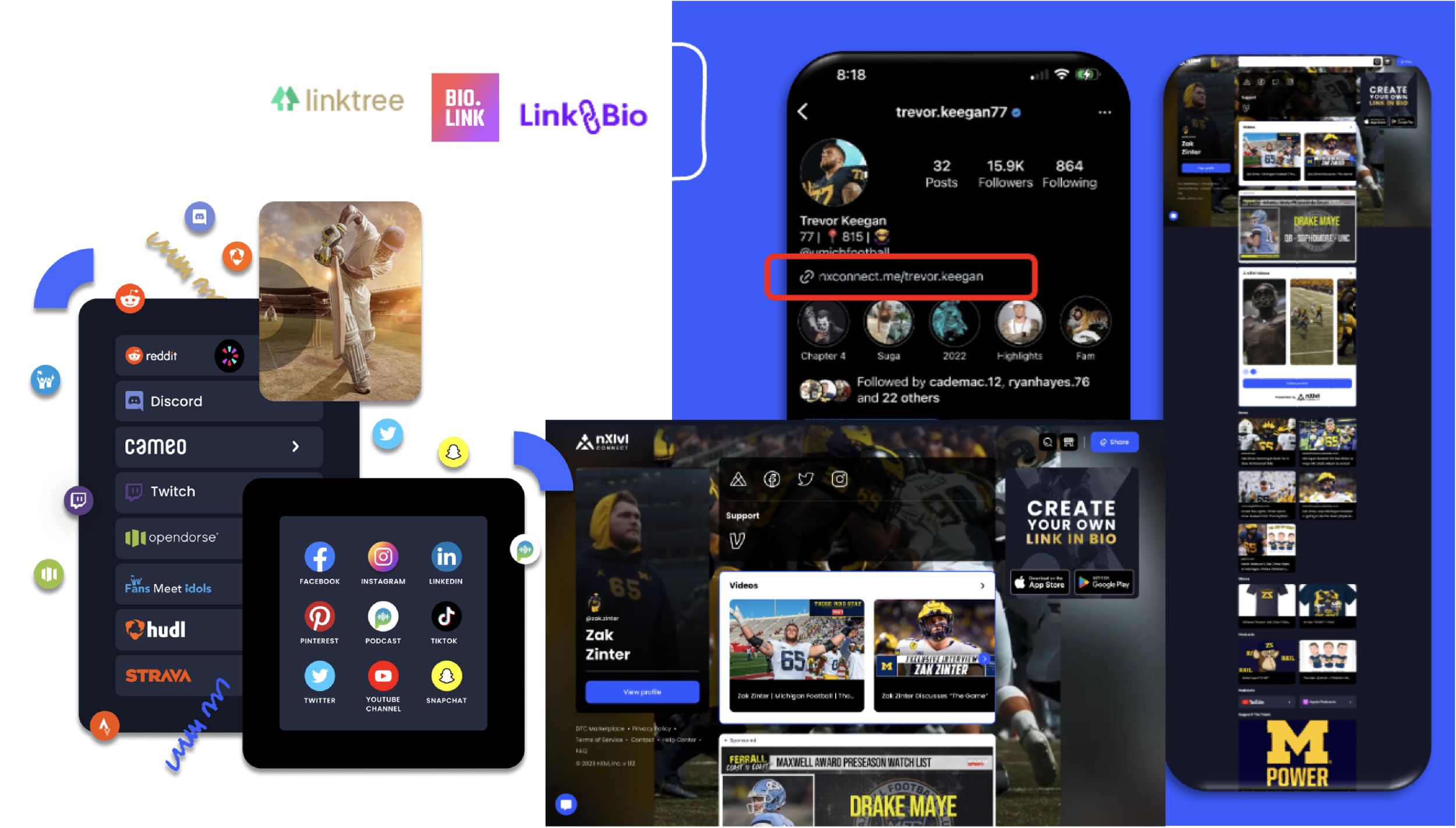
A part of high-fidelity UI of nXlvl Connect

Explore the complete User Guide for nXlvl Connect.
SUPPORTING FEATURE DESIGN
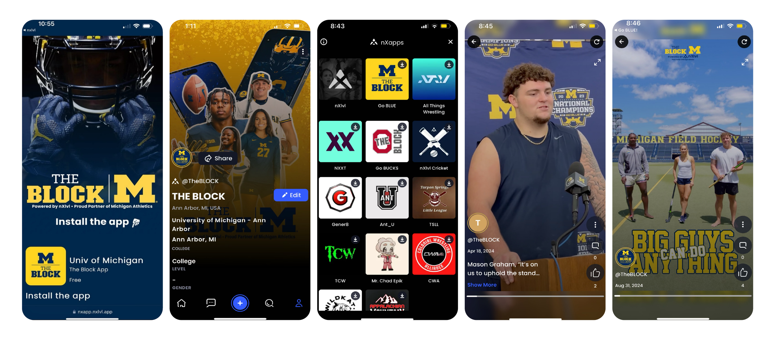
How to build your activity profile?
The "nXlvl Build Your Activity Profile" feature is designed to help athletes and creators showcase their achievements and talents in a comprehensive and engaging way on the nXlvl platform. This feature allows users to create a detailed profile that highlights their skills.

A part of high-fidelity UI of Build your activity profile

Explore the complete User Guide for Build your activity profile.
8. Market Release & App Store Deployment
Conduct final QA testing to ensure smooth performance.
Prepare App Store & Google Play Store assets (screenshots, descriptions, branding).
Launch the app and monitor post-launch user feedback & analytics

App icon

Feature Graphics
Currently, the app has 4.5 star rating!
Check out some awesome reviews below

TAKEAWAY
Building from scratch to leading a team, crafting an end-to-end design system has been a journey of growth, collaboration, and innovation—turning challenges into opportunities and vision into reality.
Working on the end-to-end design system has been both a deeply rewarding and enriching experience. It has been my first time building something from zero upto leading a team and independently driving a feature, which came with significant responsibilities but also immense growth. Collaborating in a dynamic environment, where diverse perspectives converge into a unified creative vision, has been truly inspiring. Additionally, stepping into a developer's mindset at times has enhanced collaboration, fostering smoother workflows and more impactful outcomes. This journey has not only strengthened my skills but also deepened my appreciation for cross-functional teamwork and innovative problem-solving.
Designing an Accessible Mobile App for Marathons, navigating virtual running experience for global runners.
An app that streamlines the user journey with intuitive navigation for the TCS Marathon, enhancing engagement and simplifying participation.
TITLE
TCS Marathon Application Design
ROLE
UI/UX Designer- Systems Engineer - Digital Interactive
HATS WORN
UI/UX Design, Product thinking, Visual Design, End-to-end design
TEAM
1 Designer (myself), 8 Front-end developers, 4 Back-end developers, 2 CMS developers, 2 Testers, 1 Product owner, 1 Product manager, & 1 Product delivery manager
TOOLS
Adobe Creative suite, Testflight, Zepline, Figma & Keynote
DURATION
2020-2022

This project is under a strict Non-disclosure agreement (NDA). Parts of the design are missing. Please connect to learn more.

PROBLEM STATEMENT
How we might help users to build relationships and enhance running event experiences through technology and innovation, supporting our belief in sports as a unifying force?
SOLUTION
Designing an Accessible Mobile App for Marathons, Navigating Virtual Running Experience. The app, a solution for enhancing the event experiences through technology and innovation; indicating strong engagement and user interaction.
MY CONTRIBUTIONS
Led the strategic product discussions to align decisions with business goals..
Designed and shipped end-to-end features with broad, ambiguous scope.
Contributed for creating a Design System built in Adobe XD (Check out the article here).
Crafted visual designs, including Ul, typography, color, layout, and iconography.
Defined product goals, identified opportunities, and made user-centric, impact-driven decisions.
Conducted thorough research on the Design System to ensure brand identity consistency.
Contributed for designing of 15+ globally released mobile applications, included New York City Marathon, TCS Summit North America, Chicago Marathon, Boston Athletic Association, London Marathon, NYC Half (NYRR), Singapore Marathon, Mumbai Marathon, Toronto WaterfrontMarathon, Lidingöloppet, City2Surf, World 10k Bengaluru, Canberra Marathon, Amsterdam Marathon and more.
PROCESS
Started with benchmarking. Concluded with user testing to maximize business impact.
For the TCS marathon app, I reviewed the current design to ensure consistency and explored new, distinctive designs for new features. I created low to high-fidelity prototypes, iteratively tested and refined them based on user feedback. Using Testflight, I conducted final testing and optimized the design before launch.

IMPACT
The Design of an Accessible Mobile App for Marathons, Navigating Virtual Running Experience has resulted to 1.6M app downloads and $110M raised for charity annually.
BACKGROUND
TCS Marathon app launched, transforming marathon events with innovative digital features.
Tata Consultancy Services (TCS) saw the need for a better marathon experience due to challenges with participant engagement and event management. Traditional methods struggled to meet the expectations of modern, tech-savvy runners.
In response, TCS developed the TCS marathon apps, offering live tracking, personalized experiences, and social media integration. This app significantly enhanced user satisfaction and engagement, setting a new standard for marathon events worldwide.

APPLICATIONS I WORKED ON

Email me to get in-depth case study about the TCS Marathon App.
TAKEAWAY
Empowering marathon app success through user-driven design boosts team morale and propels clarity into action!
Personally, I learned that prioritizing user-centric design is crucial not only for product quality but also for team morale. Throughout the TCS Marathon app project, which spanned over a year and often felt exhausting, engaging users made a significant difference. By focusing on intuitive navigation, real-time updates, and accessible features, we addressed user needs effectively. Sharing user feedback with the team, especially the positive responses and clear improvement areas, rejuvenated everyone. It provided a sense of accomplishment and clear direction, transforming ambiguity into actionable insights and boosting overall team pride and motivation.

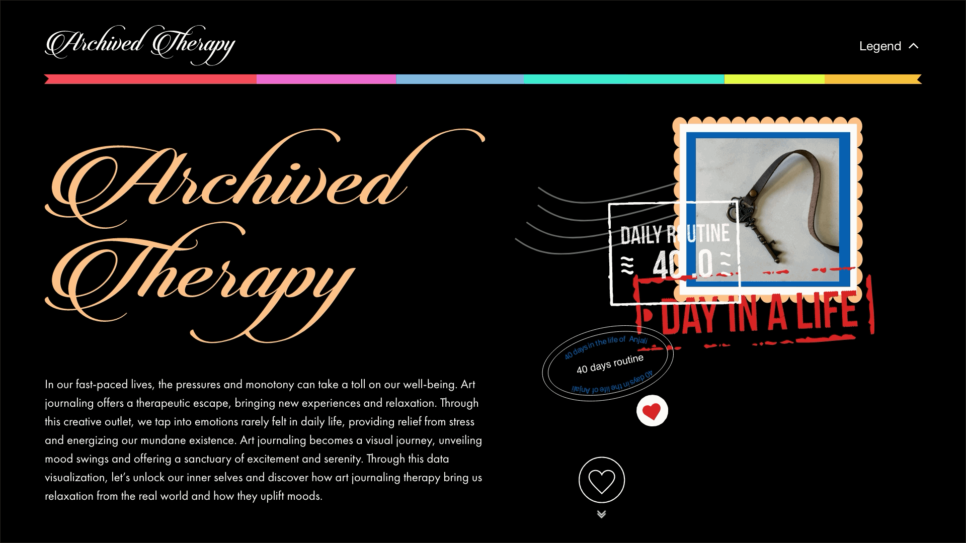
Mapping a web-based data visualization of my 40-days Art Journal routine, capturing personal insights and experiences.
This project maps a web-based data visualization of my 40-day art journaling journey, capturing moods, emotions, and creative patterns. It offers a visual narrative of personal growth, self-reflection, and thematic exploration through daily artistic expression. The goal is to reveal meaningful insights hidden within the creative process.
TITLE
Web-based Data Visualization
ROLE
Designer
HATS WORN
UI/UX Design, Web Design, Visual Design & Tabulation
DURATION
2023
TOOLS
Adobe Creative Suite, Microsoft Excel & Keynote
TEAM
Individual Project
PROBLEM STATEMENT
How might we design a web-based system that transforms daily activities into a structured, easily trackable format through intuitive tabulation?
SOLUTION
Tracking artistic patterns and emotional influences over time can be challenging. This project visualizes 40 days of an art journal through a web-based data visualization, mapping moods, feelings, and creative concepts to reveal insights into the artistic process and thematic evolution.
PROCESS
How it all began!
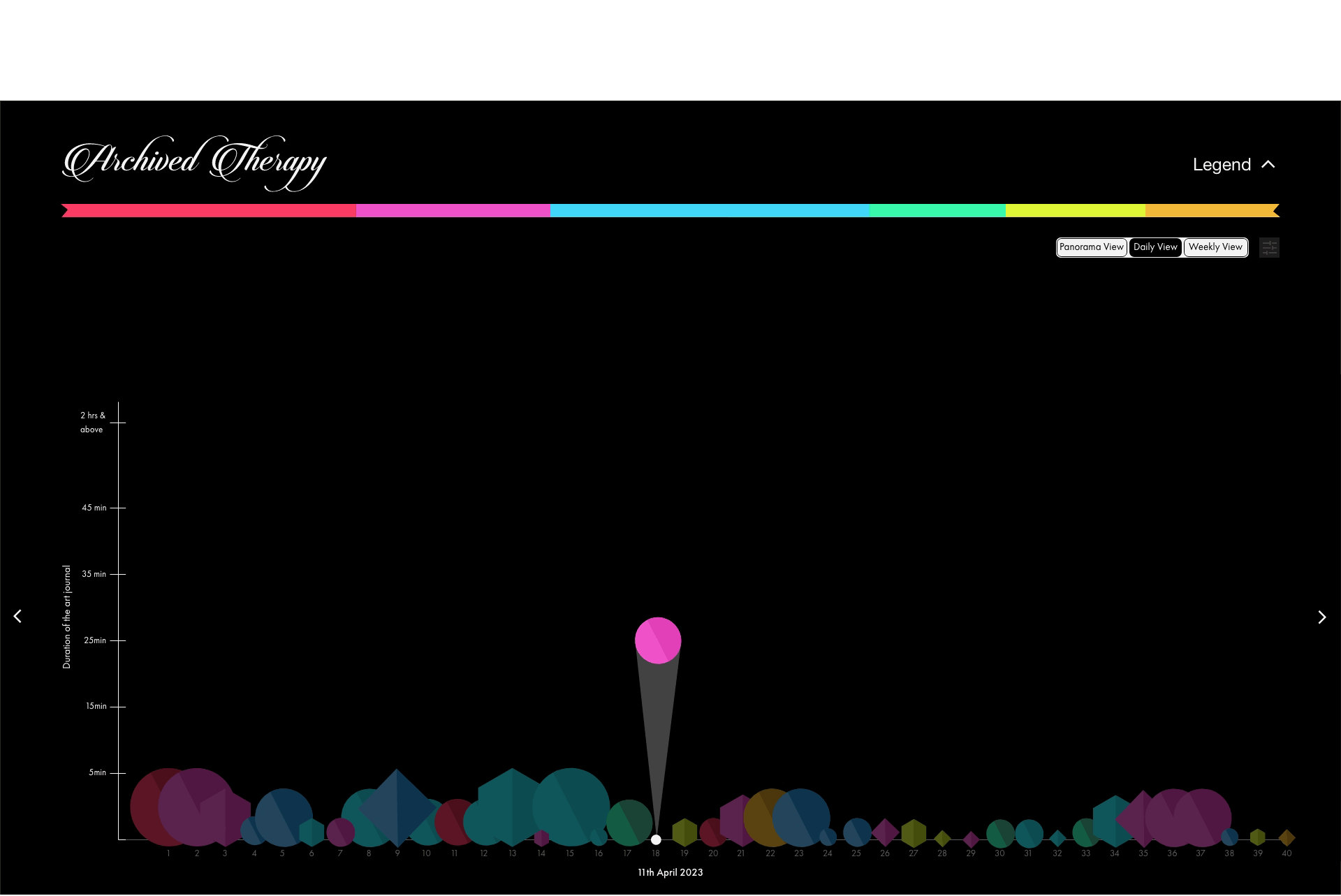
Over a span of 40 days, I systematically recorded key details such as date, day, time, weather conditions, activities, people around me, duration, emotions, location, music and sleep patterns. The complete dataset is available in the below linked spreadsheet for review.
Key insights from the Dataset
I practiced daily art journaling based on various themes or prompts, using different journal sizes, based on time availability.
Organizing & Color-coding the Dataset
I organized and color-coded my art journal data from the primary dataset, categorizing it by day, date, emotions before and after journaling, themes, gratitude prompts (and their reflection in my journal), journal size. color palette, duration, time of day, social media presence, and documentation mode (photo, video, or both).
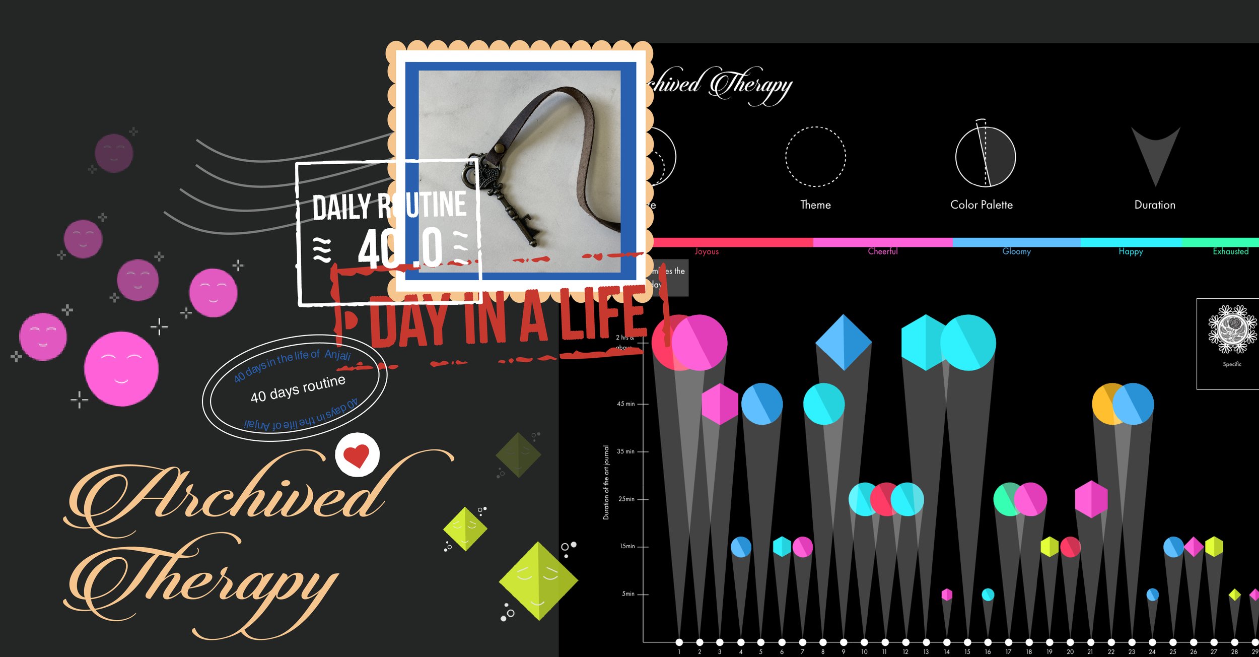
FINAL DESIGN
The web-based data visualization, titled “Archived Therapy”, serves as a means of translating my subconscious mind into a tangible, conscious experience.
The representation below illustrates my journal size, the theme explored, the color palette used, the duration, my emotions throughout the day, and the emotional shift experienced after creating the journals.

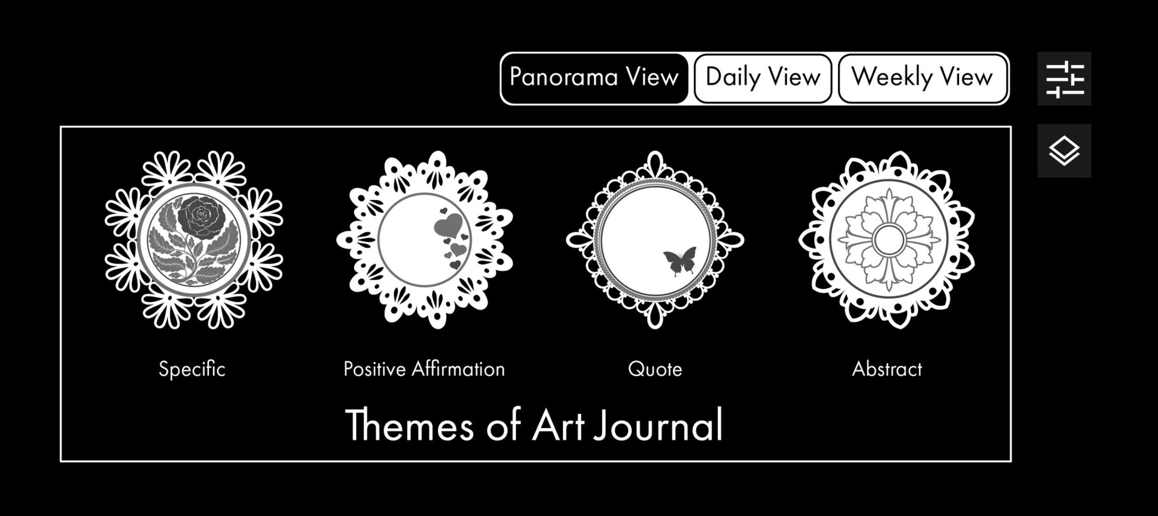
Adding more to the above representation, activity can be tracked on a daily or weekly basis, in addition to the Panorama view.

Different dollie sheets have been used to represent the various themes of the Art Journals.
MODEL PREVIEW
1. Users can access the legend to view details or navigate to the main Panorama view by tapping on the legend menu at the right hand side top of the screen.

2. Tap the heart icon—once it turns red, it indicates that you're ready to proceed to the main page.
3. In addition to the legend, there is a toggle button that provides a deeper exploration of the journal’s themes.

4. Let’s take a quick look at the Daily View for a better understanding of how this web-based data visualization works.
4. Here’s a final look at the Weekly View. Don’t forget to explore the prototype for a hands-on-experience!


TAKEAWAY
This data visualization offers a unique glimpse into my 40-day Art Journal routine, mapping the interplay between moods, themes, creative expressions, and daily influences. By analyzing patterns in emotions, color palettes, journal sizes, and creative prompts, the project highlights the therapeutic impact of journaling and its role in self-reflection and artistic exploration.
To enhance the experience, I used Adobe XD to prototype the interface, incorporating hover effects, interactive elements, and playful animations to bring the visualization to life. These dynamic interactions add a sense of engagement and fluidity, making the exploration of data both intuitive and immersive. This visualization serves as both personal archive and an interactive experience.
Designing a mental health care interface for tweens, focused on educating them about bullying, its impact, and strategies to overcome victimization.
An App that empowers tweens to independently engage in activities while learning valuable lessons on bullying prevention through interactive and educational modules.
TITLE
Tweentoon Responsive Application Design
ROLE
Designer
HATS WORN
UI/UX Design, User Problem, Brand Identity & Visual Design
TOOLS
Adobe Creative Suite, Miro, & Figma
TIMELINE
8 Weeks
TEAM
Individual Project

PROBLEM STATEMENT
How might we help tweens recognize, address, and communicate about bullying; therby improving their wellbeing and adaptability?
Success Metrics: User Engagement and Communication
Achieving high user engagement and communication effectiveness by attaining increased participation rates, high completion rates of educational modules and improved self-reported communication about bullying incidents among tweens within the Tweentoon application, indicating strong adoption and impact of the platform.
SOLUTION
Experience mindfulness and therapy anywhere with Tweentoon’s immersive, device-friendly tools and techniques
Tweentoon will engage you with it’s immersive learning experiences that is effective regardless of device, screen size or location. Offering you proven tools, techniques, and activities contained in the app that stay forever, in an approachable way without taking away the fun.
Tweens can earn badges for completing activities, unlocking new activities, games, stories and music that will help them move along their learning journey!
RESEARCH
Cartoon Network has previously done campaigns on “Stop bullying: Speak up”
2016: Improve communication to combat bullying
2018: Stop bullying before it starts: Giving kids a voice
2020: Tween cyberbullying in 2020
After 2020, Cartoon Network has not launched any new campaigns. The most notable update has been its integration into Warner Bros. Discovery, a transition that occured following the merger between WarnerMedia and Discovery, Inc. in 2022.
APPROACH
Embracing the post-2020 tech shift, I launched a new fictious campaign, seamlessly integrating application design.
As there was a significant shift after pandemic, tweens to adults became more adept with technology. In line with this trend, I decided to continue the tradition by launching a new fictitious campaign, now integrating technology through innovative application design.
1.Secondary Research 2.Competitive Analysis 3.Ideation 4.User Research
1. Secondary research
There were three things of primary interest that I addressed through my secondary research. I wanted to know
Tweens lack knowledge & confidence of how to speak up for themselves and other.
Resources to give knowledge to the child.
Integrating this into school extracurricular programs with the aim of establishing it as a mandatory area of learning.

Takeaways from the online existing sources I collected

The metrics people utilize vary depending on whether they are experiencing bullying, bullying others, or supporting someone by speaking up against bullying.
Some other common methods apps use in order to keep users motivated to practice learning include
Online communities
Sharing victory
Following challenges
Earning badges/ rewards
Record stats
2. Competitive Analysis
I listed down the features of leading health apps from the App Store and noted the differentiations and overlaps through a Venn Diagram. I was particularly interested in the overlaps in features because it gave me a good baseline of the features I should consider for Tweentoon.
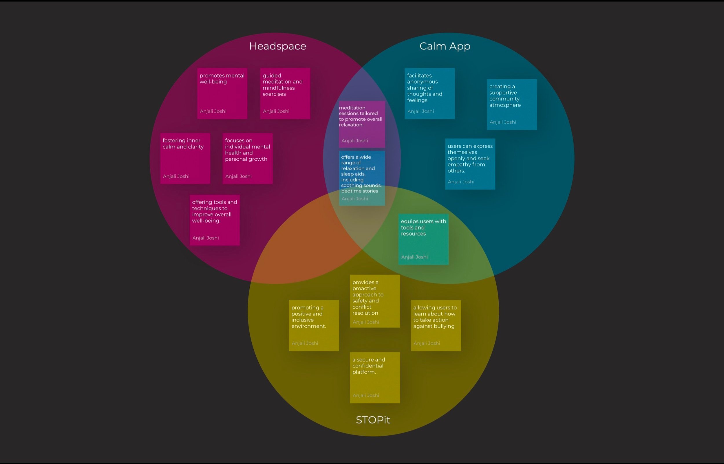
Comparisons from top apps Headspace, Calm & STOPit
Overlapping features include syncing abilities with other apps, and challenges for the community or your kids to participate in.
3. Ideation
After carefully evaluating the features of various competing apps in the market, I concluded that the ideal output should encompass the following:
Learning-based platform focused on raising awareness about bullying
Immersive guided experience for learning
Integrates mindfulness, kindness, games, music, videos, and interactive features
Convenient all-in-one platform, eliminating the need for multiple app downloads
The main aspect of the app naturally encourages learning and I used this opportunity to introduce badges in hopes of making learning healthy.

I leveraged this opportunity to collaborate with schools, integrating this into their extracurricular curriculum. This approach allows tweens to acquire knowledge at an early age. Additionally, it offers the flexibility to download certificates at any time and , in case of changing schools, enables the addition of a new school code to transfer earned credits.
The layout is designed to reduce visual clutter for easier scanning.
4.User Research
Method: Survey, Sorting
Bullying experiences are unique and personal to each individual.
With that in mind, I conducted an open-ended survey (Google Forms) with 6 active people within the residential community and asked them about the bullying experience among their tween or kids and what steps they are taking for it.

The answers fell under 2 categories: physical bullying, & verbal bullying.
I also asked them if there were anything they would be curious about and gained an important inspiration.
Creating a common space where parents, & teachers both could come together and share about any unusual activity/ incident occurred in the classroom anonymously.

Who are the focus target groups?
Target group 1 : Tweens struggling to communicate
Target group 2 : Adults willing to help
User Persona
From the research insights that I collected from users, I gauged the persona


DESIGN
Visual Identity
How we write our name, how we use our symbols- these are the closest we get to a “signature” for Tweentoon. How they appear, whether tiny on a screen or enormous on a banner, becomes a crucial way for our audience to find and trust us.


FINAL DESIGN
Experience seamless, vibrant, and accessible learning with the new responsive Tweentoon app!
For the Tweentoon app, I designed a responsive screen layout that maintains the color scheme and theme of previous campaigns. The design is user-friendly and engaging for tweens, with thorough testing across devices to ensure responsiveness. Accessibility features were included to enhance usability. Visual and interactive elements from past campaigns were integrated, ensuring brand consistency and optimized performance for a seamless user experience.

User testing


…
Prototype (User Guide)
Onboarding for new users
Onboarding for existing users
A quick dive into the activity feature to view the functionality of different activities
A quick glimpse into the music feature
Walkthrough of Parents Teacher Community feature
CONCLUSION/ TAKEAWAY
For the Tweentoon app, I designed a responsive screen layout that maintains the color scheme and theme of previous campaigns. The design is user-friendly and engaging for tweens, with thorough testing across devices to ensure responsiveness. Accessibility features were included to enhance usability. Visual and interactive elements from past campaigns were integrated, ensuring brand consistency and optimized performance for a seamless user experience.
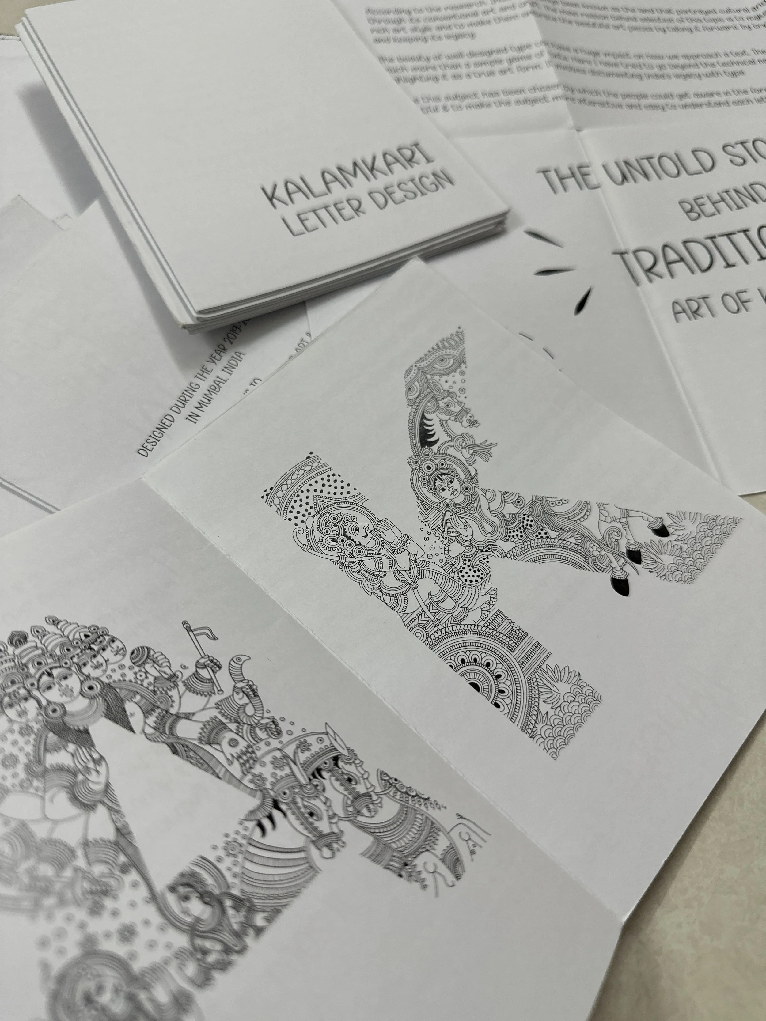
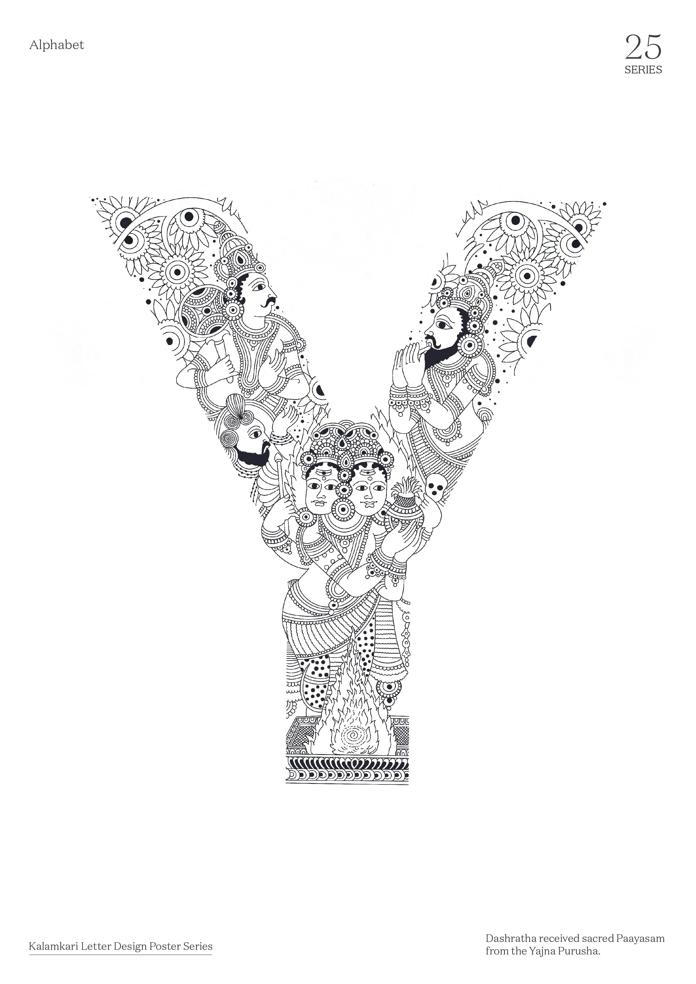
Creating an Experimental Display Type influenced by Hindu Epics. Each letter is incorporated with a story making it interactive.
A letter design (typography) project inspired by traditional Indian Kalamkari Art. This experimental display type is influenced by Hindu culture, features religious themes and scenes from the Ramayana and Mahabharata. Each letter is incorporated with a story, making the design visually impactful and interactive.
TITLE
Kalamkari Letter Design / Kalamkari Type Design
ROLE
Designer & Strategist
HATS WORN
Graphic design, Type design, Conceptualization, Story-telling & Illustration
TOOLS
Adobe Illustrator. Adobe Photoshop, Adobe After Effects & Procreate
DURATION
12 Weeks
TEAM
Solo Project
Terms and conditions applied*
The Type/Letter series is a copyrighted and protected work under the Indian Copyright Act, 1957. Any form of copying, plagiarism, or infringement will be subject to legal action under Sections 51, 63, and other applicable provisions, and may result in penalties including fines and imprisonment.
Kindly ensure you reach out to me for permission before using this content in any context, including for educational purposes.
Sneak into some special Instagram features!
PROBLEM STATEMENT
How might we create a visual language system that enriches written communication by integrating Kalamkari Art inspired by the Ramayana & Mahabharata?
Success Metrics: User Engagement and Enrichment
Achieving high user engagement and enrichment in written communication by attaining increased adoption rates, frequent usage of the visual language system, and improved user satisfaction. Additionally, fostering a deeper cultural appreciation and understanding of Kalamkari art and mythological stories from the Ramayana and Mahabharata, indicating strong integration and impact of the system.
SOLUTION
Creating letter designs that incorporate stories from the Hindu epics, Ramayana and Mahabharata
The term “Kalamkari” is derived from Persian, where “Kalam” means pen and “Kari” refers to craftsmanship.
Kalamkari art has been my favorite art since childhood., and through this project, I aim to express my gratitude and contribute to the revival of this beautiful, yet fading, Indian art form. The power of imagination is boundless, and I sought to capture this in my letter designs.
The project features a stylized, experimental display typeface heavily influenced by Hindu culture. Each letter is intricately designed to reflect religious themes and scenes from the Ramayana and Mahabharata, showcasing the richness of these epic stories.
RESEARCH

ABOUT TYPOGRAPHY
Typography is what communication looks like. Typography is the use of type to advocate, communicate, celebrate, educate, elaborate, illuminate, and disseminate. Along the way, the words and pages become art. Type and typography fostered books, magazines, catalogues, newspapers, forms, and a plethora of promotional materials.
TYPOGRAPHY MAJOR DESCRIPTION
Typography ("form" + "Writing" in Greek) is the art and technique of designing, modifying, and arranging type (letters and characters). Typography is a craft that involves typesetters, compositors, typographers, graphic designers, calligraphers, graffiti artists, comic book artists, and anyone who arranges type to create something. Typography is an essential element to graphic design--it expresses feelings, conveys meanings, creates contrast, highlights ideas, and adds visual interest to the content that you're designing. The further pointers describes about type critically and how to use it more effectively!
SELECTION CRITERIA FOR THE SUBJECT
This subject was selected because according to the criteria this subject was found more experimental in Latin script.
According to the research, India has always been known as the land that portrayed cultural and traditional vibrancy through its conventional arts and crafts. The main reason behind selection of this topic is to make people aware about India's rich art style and to make them embrace the beautiful art pieces by taking it forward, by bringing the awareness about it and keeping its legacy.

This subject aims to raise awareness through visuals, with each letter imbued with meaningful significance to enhance impact and ease of understanding.
According to the research, India has always been known as the land that portrayed cultural and traditional vibrancy through its conventional arts and crafts. The main reason behind selection of this topic is to make people aware about India's rich art style and to make them embrace the beautiful art pieces by taking it forward, by bringing the awareness about it and keeping its legacy.
WORK PROCESS
The initial stages of work went mostly consisted of the research work about the script, basic structure, and its anatomy.
The purpose of language is to communicate, both verbally as well as visually, with scripts that are symbolic in nature. The fundamental purpose of writing is to convey ideas, but the man was a designer long before he started writing. Then afterward the anatomy of a letter can perhaps be defined as a system which depicts the structural makeup of a letter; describing certain key parts within the letter for a given typeface. These morphological articulations of the characters within the font forms the first level of description within the typographic ontology of a script.
APPROACH
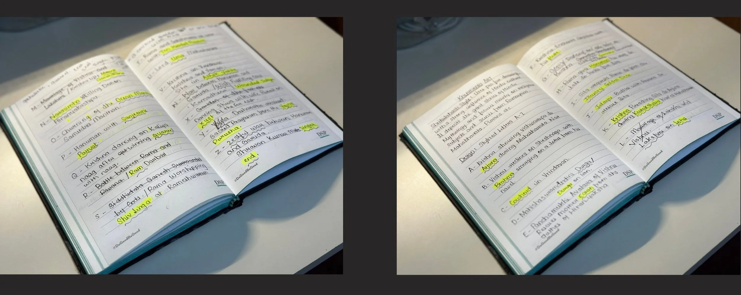
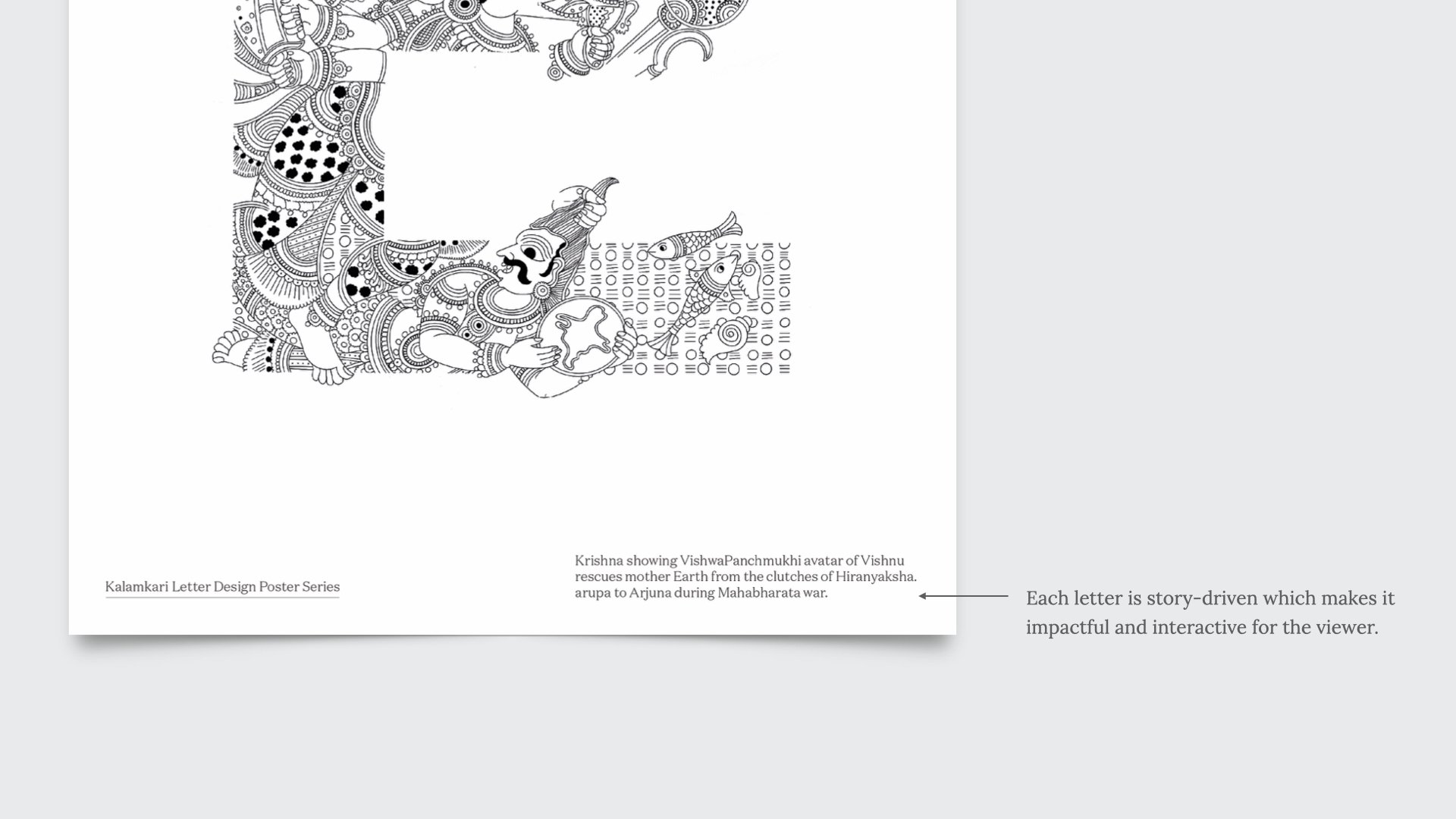
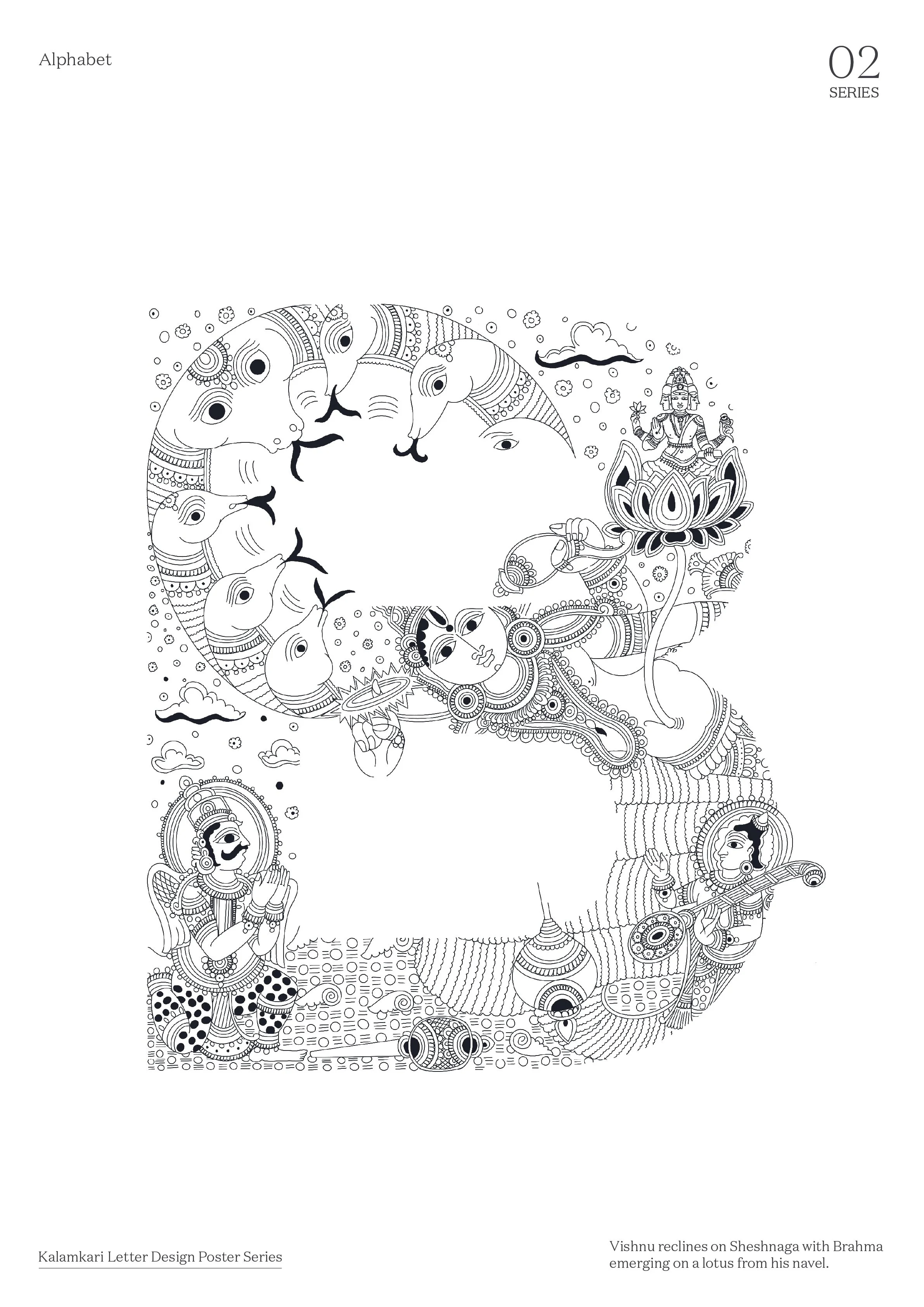
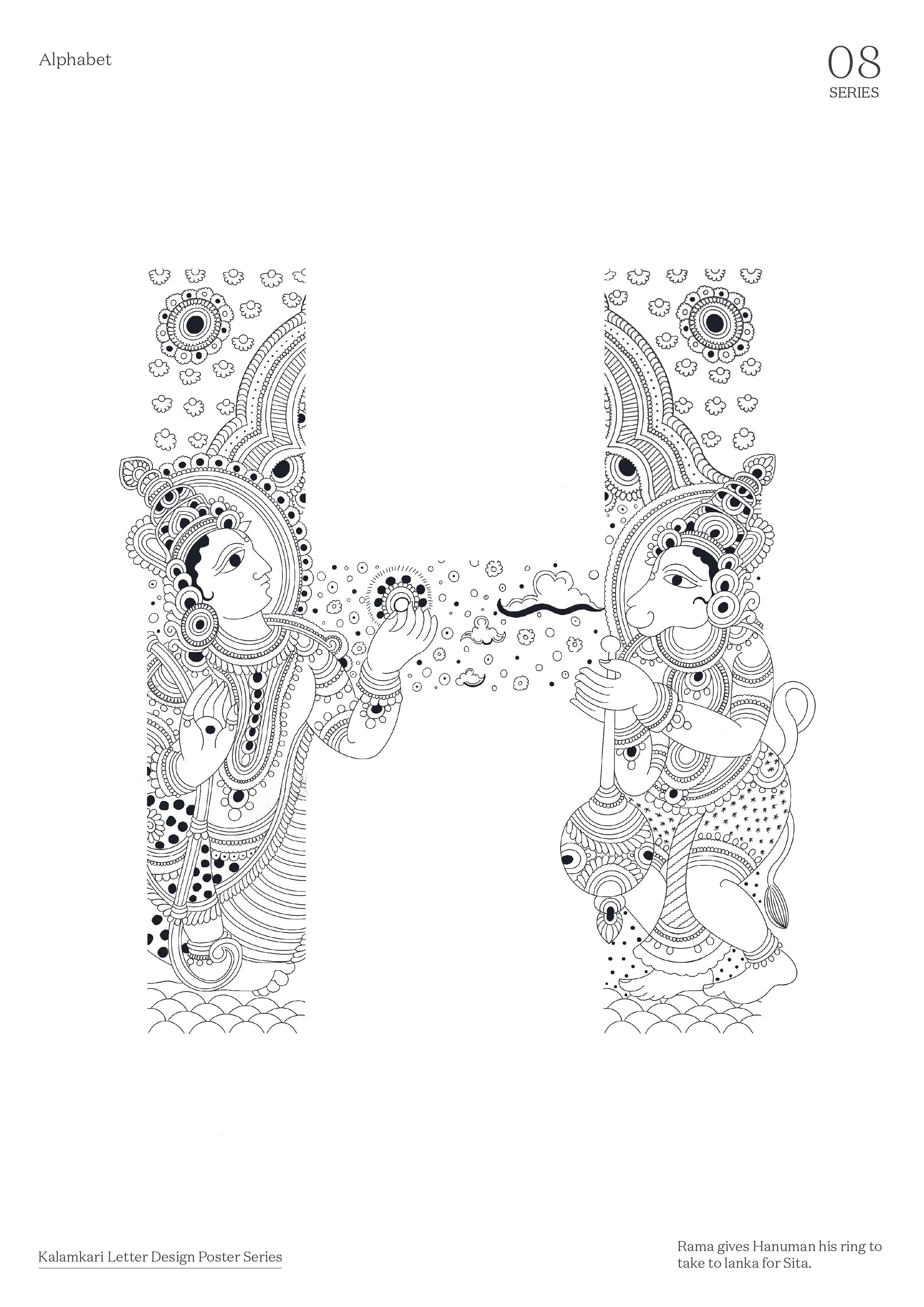
For this subject, first I collected some textual information on Kalamkari art form of India. Once the information was ready, I had to short list 26 stories as per each letter which would be perfect for the execution part So, I finalised the stories based on Ramayana & Mahabharata.
FINAL DESIGNS
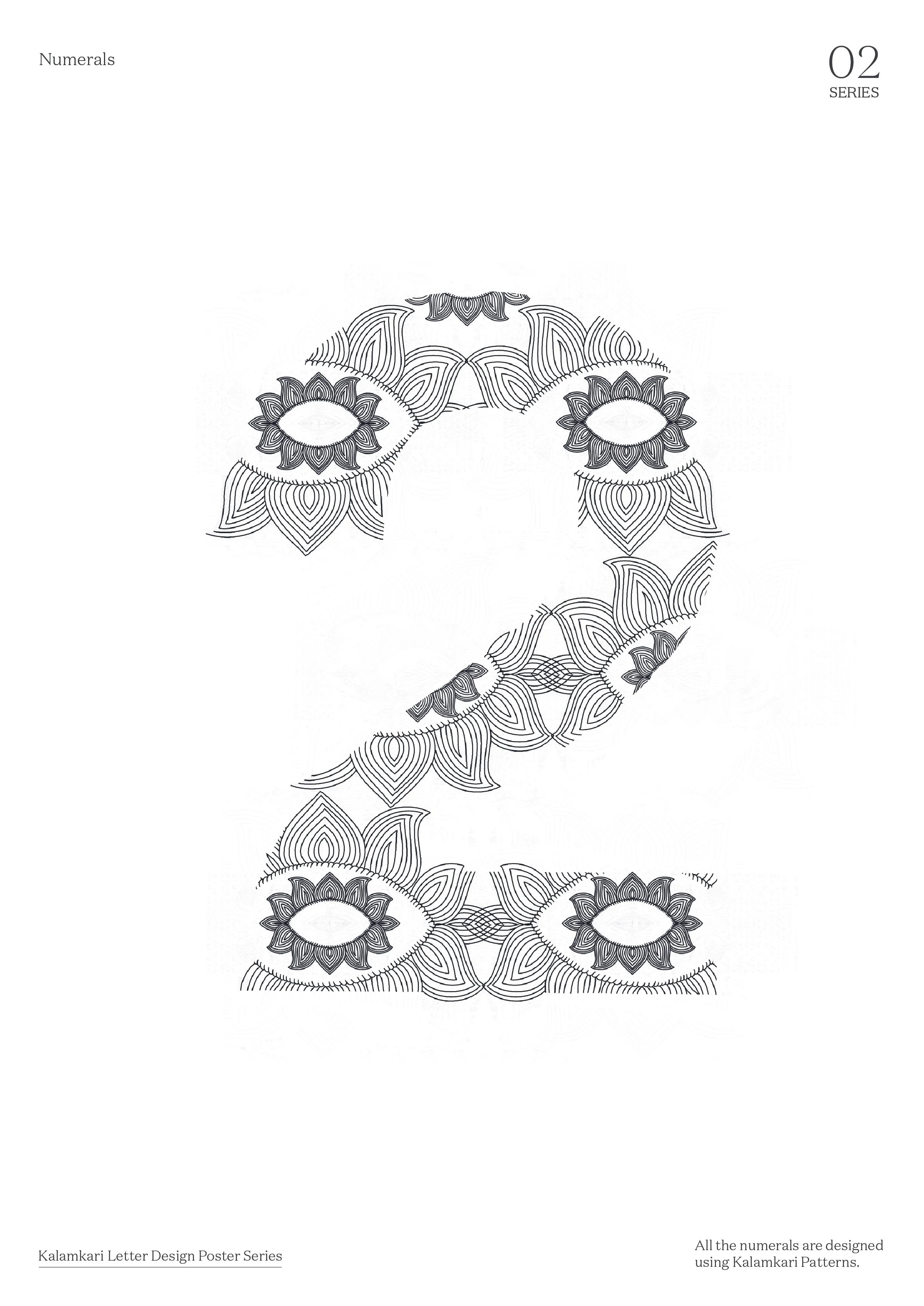
Unravel captivating tales in evert letter, blending Kalamkari art-inspired numerals and punctuations from Ramayana and Mahabharata for a visually rich language experience.
Each alphabet holds within it a tapestry of captivating stories, waiting to be unraveled. The numerical symbols, meticulously crafted in the enchanting patterns of Kalamkari art, bring a touch of artistic beauty to our numerical system.
Furthermore, the punctuations gracefully incorporate characters from the timeless epics of Ramayana and Mahabharata, lending an air of myth and legend to our written language. Together, these elements intertwine to create a rich proposed visual solutions


IMPACT & TAKEAWAY
I believe this project will deeply resonate with audiences by showcasing our cultural heritage and traditional life, making it unique and differentiating our work from others. This unique approach could attract more users by highlighting the timeless beauty and innocence of folk art. Additionally, the use of themes from epics like Ramayana and Mahabharata, along with augmented reality enhancements, points towards our next direction: creating immersive, culturally rich visual experiences.
Personally, this project has allowed me to reconnect with the foundational aspects of art and culture. This project reminded me of the importance of cultural preservation and its potential to drive product growth through deep, meaningful connections with users.
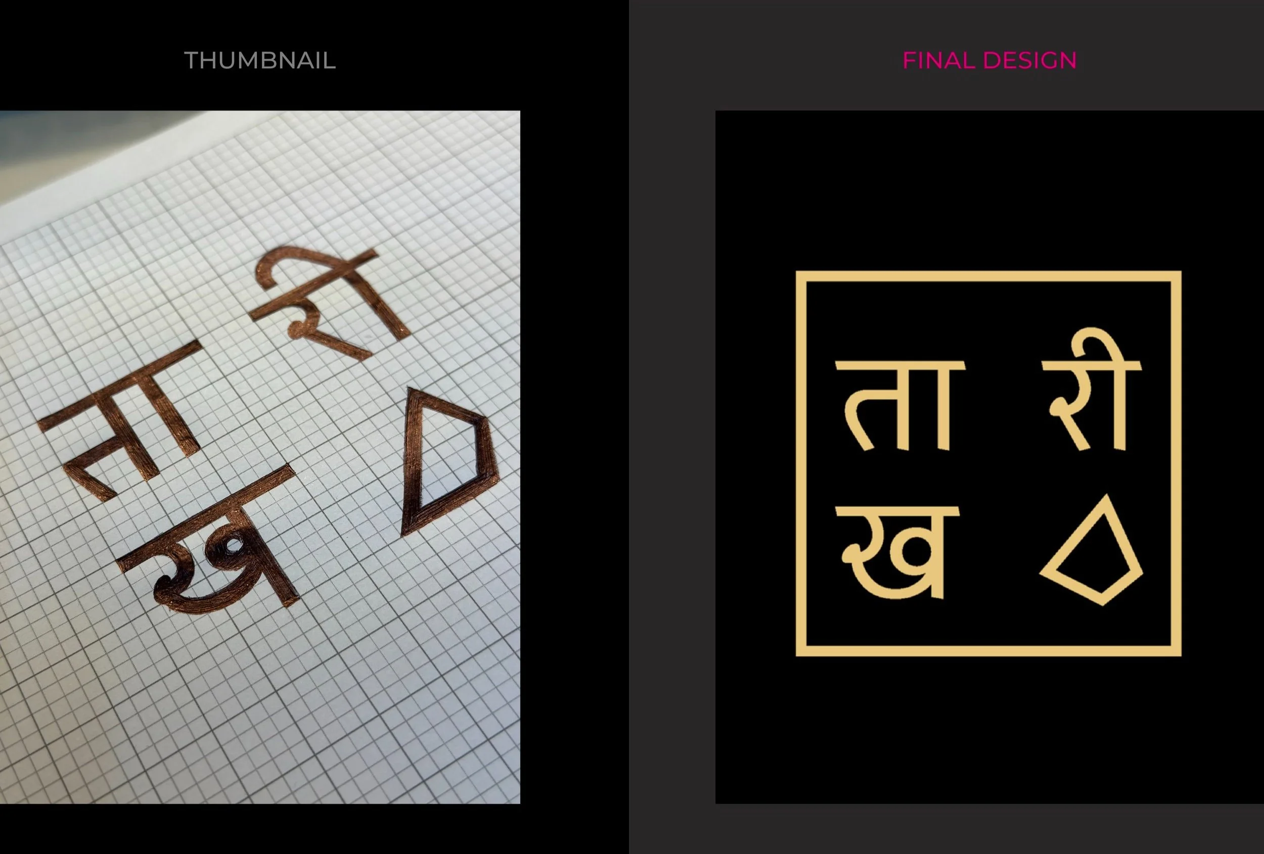
Creating a Sustainable Calendar that can be reused and reduce paper waste, achieving high adoption rate & creative engagement.
The main aim of this project was to create a calendar that can be reused and reduce paper waste. This calendar celebrates craftmanship, creativity & joy.
TITLE
Taarikh Calendar Design
ROLE
Designer
HATS WORN
Graphic Design, Branding, Conceptualization, & Packaging Design
TOOLS
Adobe Illustrator, Adobe Photoshop, Adobe Audition, & Adobe Premier Pro.
DURATION
8 Weeks
TEAM
Solo Project

PROBLEM STATEMENT
How might we design a sustainable, reusable calendar that celebrates craftsmanship and creativity while reducing paper waste, something that can be used lifetime?
Success Metrics: Sustanibility and Creative Engagement
Achieving sustainability and creative engagement by attaining high adoption rates of reusable calendars, frequent use throughout multiple years, and improved user satisfaction. Additionally, fostering a deeper appreciation for craftsmanship and creativity, indicating a significant reduction in paper waste and strong impact of the Taarikh brand's mission.
SOLUTION
Creating a sustainable calendar that serves as a one-time investment, significantly reducing paper usage.
Creating a sustainable calendar designed to be a one-time investment, which significantly reduces paper usage by eliminating the need for annual replacements. This innovative approach promotes environmental responsibility while maintaining the functionality and aesthetic appeal of traditional calendars. By encouraging reuse and minimizing waste, this calendar not only supports eco-friendly practices but also reflects a commitment to sustainability and resource conservation.
DESIGN DIRECTION

Taarikh is a Hindi word, meaning date in English. It is a fictitious brand that creates calendar.
PHASE 1
Developing identity design thumbnails for Taarikh to reflect its commitment to sustainability and creativity. The designs is incorporated with the tile motif to create a cohesive and appealing visual identity.
PHASE 2
Working on grids to achieve the final output.

PHASE 3
Final outcome

PHASE 4
"Elegant, exciting, and sustainable, Taarikh's timeless calendars break free from the one-year limit, making them as enduring as they are enchanting.”
The appealing aspect of this calendar is that one can change the dates, months, years, respectively, as time flies. This package contains a calendar board, an instruction manual, a set of extra numbers inked in red & a set of alphabets etc.
FINAL DESIGN
Final look of packaging design.


TAKEAWAY
Creating a timeless and sustainable calendar design can be deeply rewarding, providing a sense of pride and clarity in purpose.
Personally, I learned that Taarikh's timeless design is about more than just aesthetics; it's about sustainability and longevity. Though the project was lengthy and sometimes exhausting, seeing the positive reception reinvigorated me, giving me pride and clarity in my purpose.
Designing an exhibition catalog that showcases the enchanting evolution of Disney’s typography, design, color, etc.
This catalog explores Disney's transformation through the evolution of its posters over time. It features the design of a hero poster that highlights the exhibition's curation on this theme, followed by some engaging collaterals
TITLE
Exhibition Catalog, Disney in Transition: Evolution of Disney Posters
ROLE
Graphic Designer
HATS WORN
Graphic Design, Poster Design, Publishing Design, Catalog/Books.
TOOLS
Adobe Indesign, Adobe Illustrator, Adobe Photoshop, & SCAD Writer’s Studio.
DURATION
7 Weeks
TEAM
Solo Project

A copy of catlog is preserved at SCAD Museum of Art for the reference of Staff & Students.

PROBLEM STATEMENT
How might we develop an innovative catalog that delves into Disney's evolution to showcase the exhibition's thematic focus?
Success Metrics: Engaging Subject Selection and Analytical Depth
Assessing the exhibition's effectiveness in captivating audiences with the chosen topic of Disney poster transformation, evaluating the aesthetic appeal of the poster design and its alignment with the exhibition's thematic focus. Additionally, measuring the impact of the critical analvsis approach on enhancing understanding of Disney's poster evolution, and tracking the expansion of knowledge and improvement in communication across interdisciplinary fields as a result of the exhibition's insights into typography and design mechanics.
SOLUTION
Unveil the magical evolution of Disney's creative identity through a captivating exploration of typography and design in our curated analysis of lettering designs.
Embark on a journey through Disney's visual culture with our comprehensive analysis of lettering designs. Explore the evolution of design forms that have shaped some of Disney's most iconic productions, featuring a curated selection of 15 representative posters and select movie titles from classic Disnev sets. Delve into the intricacies of typography and design evolution, gaining valuable insights into the development of Disney's creative identity over time.
DESIGN DIRECTION
Creating a captivating hero poster to anchor the curated exhibition, followed by meticulously crafting a commemorative catalog to preserve its memory. Additionally, designing interactive collaterals to foster meaningful connections with visitors, providing them with memorable takeaways and collectibles to treasure from the exhibition experience.

PHASE 1
DESIGNING A HERO POSTER
We began by independently selecting a captivating subject, and then proceeded to transform our ideas into an aesthetically pleasing poster design specifically crafted for the exhibition centered around that chosen topic.
My topic was based on discovering challenges in the Transformation of Disney posters over the years based on multiple factors like culture, typeface, color, & communication.

FINAL POSTER DESIGN

PHASE 2
CREATING A CATALOG, EMPHASIZING THE TRANSITION IN DISNEY, PARTICULARLY THE EVOLUTION OF POSTERS OVER TIME.


PHASE 3
DESIGNING AN INTERACTIVE COLLATERALS FOR THE EXHIBITION.

PHASE 4
CATALOG PRINTING & BINDING PROCESS
The way a publication is bound will impact on its look, its durability and its affordability. Selecting the right binding technique will help create a piece that's stylish, long lasting and cost effective.
One of the most popular techniques for binding a paperback book, magazine or catalogue is perfect binding. Cost effective and aesthetically pleasing, it is one of the perfect choice for this particular printed publication.

Perfect binding is a process, commonly used by printers and bookmakers, where groups of pages are bound together using adhesive to create a clean, crisp and professional printed product. It involves printing one or more sheets containing sets of pages which are then laid out so that once the sheet is folded, they create a group of pages known as signatures. These signatures are stacked together and the edges, which will form the spine, are roughened to improve adhesion. An adhesive is then applied to the spine before a cover is wrapped around them. Once the glue has dried, three of the sides are trimmed to create the finished publication.

TAKEAWAY
Uncovering the magic of Disney typography to enhance communication in creative fields.
Through the analysis of Disney's iconic letter designs in visual culture, I gained a deeper understanding of the evolution and historical context of these designs. By critically examining 15 representative posters and movie titles, I learned how typography influences and enhances communication. This project revealed that studying the formal characteristics of lettering can open new avenues for improving communication across creative, technological, and educational fields.
Re-branding to raise awarness, aiming to preserve Cabbagetown’s authentic character in the new identity for Chomp & Stomp event.
The purpose of this project is to raise awareness about Atlanta's Cabbagetown neighborhood and its rich history, ultimately aiming to preserve its authentic character in the new identity for the Chomp & Stomp event.
TITLE
Chomp & Stomp Event Rebranding
ROLE
Graphic Designer
HATS WORN
Graphic Design, Rebranding, Problem solving, & Communication design
TOOLS
Adobe Illustrator, Adobe Photoshop, & Keynote
DURATION
3 Weeks
TEAM
Solo Project

A part of this project will be used in the upcoming event!

PROBLEM STATEMENT
How might we retain the authentic look of Cabbagetown while creating a new identity for the Chomp & Stomp event?
Success Metrics: Win due to part of it being used in the upcoming event
The success of the new identity for the Chomp & Stomp event will be measured by community feedback on the authenticity of the design, increased attendance at the event, and enhanced engagement on social media platforms reflecting the historical and cultural essence of Cabbagetown.
SOLUTION
Crafting an authentic Chomp & Stomp identity that celebrates the rich heritage of Cabbagetown.
Develop a new identity for the Chomp & Stomp event that incorporates key visual elements and design motifs from Cabbagetown's historical and cultural heritage. This will involve engaging local artists and historians to ensure authenticity, and conducting community consultations to gather feedback and ensure the design resonates with residents and visitors alike.
RESEARCH

CABBAGETOWN
It’s east of downtown Atlanta

TALE 1:
According to Marion A. "Peanut" Brown, when she moved to the Fulton Bag and Cotton Mill Village in 1919 she got her first job peddling produce on foot and carrying baskets of sweet potatoes from door to door. There she met and worked with Joe Newman from a mule-drawn wagon. They peddled around town through the week but on Fridays and Saturdays many produce wagons would park at one of three different mill gates. They soon found that cabbages sold better than all the other produce and decided to take entire loads of nothing but cabbage, thus the beginning of the name Cabbagetown. She says the name slowly spread and by the mid 1930's the place was well known as Cabbagetown.
TALE 2:
Another explanation is the mostly transplanted poor Appalachian residents (largely of Scottish-Irish descent) who worked in the nearby Fulton Bag and Cotton Mill, would grow cabbages in the front yards of their shotgun houses and one could distinctly smell the odor of cooking cabbage coming from the neighborhood. People outside the neighborhood said "Cabbagetown," with derision, but it soon became a label of pride for the people who lived there. A variation of this explanation is that a local cab company operating off Memorial Drive gave nicknames to various neighborhoods they serviced and the specifically called the mill town Cabbagetown, because of the smell.
TALE 3:
Yet another explanation is that a train carrying a load of cabbages derailed by the mill adjacent to the neighborhood and the poor residents quickly accumulated the cabbages and used them in just about every meal. A variation of this legend has a Ford Model T taking a sharp turn at one of the main intersections of Cabbagetown, and flipping over spilling its cargo of cabbages across the street. Someone yelled "Free Cabbages!" and they were soon carted away by the residents.
INTRODUCTION
Cabbagetown is one of Intown Atlanta's best-kept secrets. It's a small and artsy historic neighborhood. The entire neighborhood is around only four square blocks but considered to be a hub of art and culture.
The purpose of this project is spread awareness about the nighborhood and its rich history among people and make better use.
HISTORY
Cabbagetown's rich history dates back to 1881 when it was populated primarily by Scottish and Irish Textile Mill Worker. It is one of the Atlanta's oldest settlement.
It is comprised of shotgun and cottage style homes. A German Jewish immigrant Jacob Elsas spearheaded the construction of the Fulton Bag and Cotton Mill.
CULTURE
Cabbagetown is home to a unique mix of families, singles, young couples, artists and professionals. Home style include farmhouse Victorians, bungalows and early 1900's shotgun style homes.
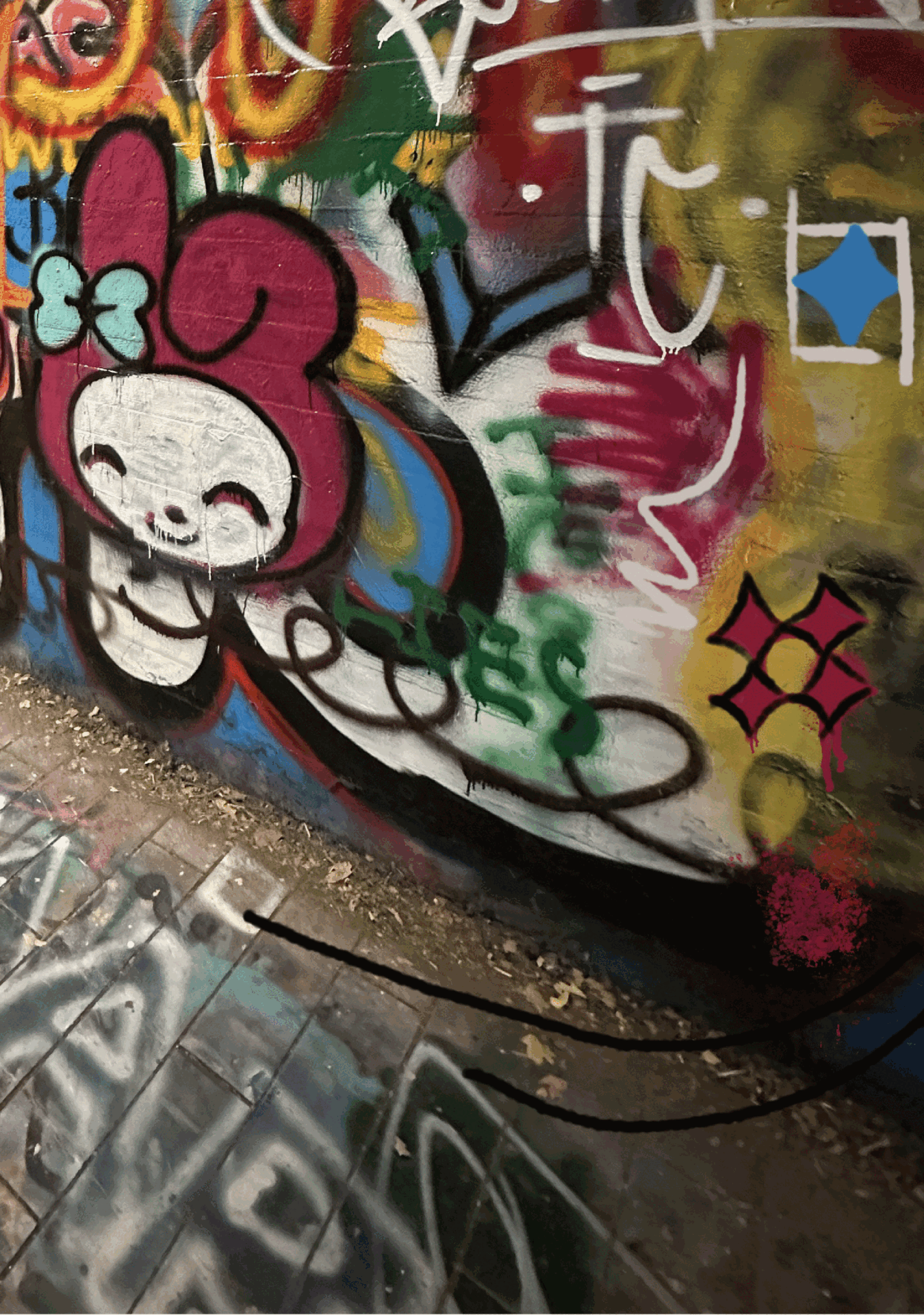
The Chomp & Stomp event in Cabbagetown, Atlanta, is an annual chili cook-off and bluegrass festival. It's an annual cultural celebration.

Photographs from Cabbagetown


CHOMP & STOMP EVENT
It’s an annual chili cook-off and bluegrass festival
ABOUT
Chomp & Stomp typically takes place in the Cabbagetown neighborhood, known for its artistic and bohemian atmosphere. The event features a chili cook-off where local chefs and residents compete to showcase their best chili recipes. Attendees can purchase tasting spoons to sample different chili entries and vote for their favourites.
In addition to the chili competition, Chomp & Stomp often includes live bluegrass music performances, art displays, and various vendors selling food, drinks, and crafts. The festival provides a lively and community-oriented atmosphere, attracting both locals and visitors to enjoy a day filled with good food, music, and fun.
Photographs from Chomp & Stomp event 2022


Brand Personality: Quirky, Creative, Collaborative, Energetic & Inviting
Target Audience: Millennial, Gen Z
Brand Voice: Authentic, Lively, Joyous, Colourful
DESIGN DIRECTION
Color Palette
The color scheme complements the chilli cook-off, blending well with the chilli’s essence and the Cabbagetown's vibrant spirit.

Typography
Helvetica & Spray letters

Derivation of Patterns
All patterns are extracted from the existing murals in Cabbagetown.


Process of Logo re-design

FINAL DESIGNS

Communication Design


TAKEAWAY
A vibrant celebration of food, music, and community that strengthens local bonds and celebrates tradition.
Through my exploration of the Chomp & Stomp event, I gained a deeper appreciation for the cultural and communal impact of this vibrant festival. By critically examining various aspects of the event, including its culinary offerings, musical performances, and community engagement, I learned how such events foster social cohesion and celebrate local traditions. This project revealed that studying the organizational and experiential elements of community festivals can open new avenues for enhancing community building, cultural appreciation, and local economic development.